Ch. 10: Information Visualization for Search Interfaces
The preceding chapters have discussed user interfaces to support search, with a focus on what is known to be successful (from a usability perspective) for the vast majority of searchers. This and the following chapter describe efforts to improve search interfaces by incorporating visual information into the display using techniques from the field of information visualization.
The human perceptual system is highly attuned to images, and visual representations can communicate some kinds of information more rapidly and effectively than text. For example, the familiar bar chart or line graph can be much more evocative of the underlying data than the corresponding table of numbers (Larkin and Simon, 1987a). The goal of information visualization is to translate abstract information into a visual form that provides new insight about that information. Visualization has been shown to be successful at providing insight about data for a wide range of tasks.
The field of information visualization is a vibrant one, with hundreds of innovative ideas burgeoning on the Web. However, applying visualization to textual information is quite challenging, especially when the goal is to improve search over text collections. As discussed in earlier chapters, search is a means towards some other end, rather than a goal in itself. When reading text, one is focused on that task; it is not possible to read and visually perceive something else at the same time. Furthermore, the nature of text makes it difficult to convert it to a visual analogue.
Most likely for these reasons, applications of visualization to general search have not been widely accepted to date, and few usability results are positive. For example, Chen and Yu, 2000 conducted a meta-analysis of information visualization usability studies, with a focus on information retrieval problems. The purpose of a meta-analysis is to combine many different points in the evaluation space in order to come up with more robust and general results. Chen and Yu, 2000 focused on six visualization interface studies from five papers (Robertson et al., 1998, Allen, 2000, Sebrechts et al., 1999, Swan and Allan, 1998, Combs and Bederson, 1999). The conclusions of the meta-analysis were:
- Individual cognitive differences among participants, as opposed to differences among the interfaces, had the largest effect, especially on accuracy, and to some degree on efficiency,
- Holding cognitive abilities constant, participants performed better with simpler visual-spatial interfaces than with complex ones, and
- The combined effect of visualization in the studies was not statistically significant.
Thus, this meta-analysis found no evidence that visualization improved search performance. This is not to say that advanced visual representations cannot help improve search; rather that there are few proven successful ideas today.
On the other hand, for analytical tasks, visualization of textual information appears more promising. A visualization that is not appropriate for a general search audience might instead be quite valuable for someone with expertise and deep interest in understanding data. Thus it is useful to follow make a distinction between visualization of text for the purposes of text analysis versus visualization for search.
This and the following chapter are intended to be read together. This chapter provides a brief a summary of the core principles and standard tools of information visualization, followed by a discussion of how different data types are best visualized. This chapter also describes why visualizing nominal data, which includes textual data, is difficult. It then describes how researchers have attempted to improve search using visualization techniques. Chapter 11 discusses the vibrant area of visualization for text analysis tasks.
10.1: Principles of Information Visualization
Guidelines for designing information visualizations are available from writers such as Few (Few, 2006, Few, 2009) and Tufte (Tufte, 1983, Tufte, 1990b). Some of these guidelines overlap with guidelines from graphic design, including the need to present information clearly, precisely, and without extraneous or distracting clutter. Other guidelines relate to the special purposes of visualization. Good visualizations use graphics to organize information, highlight important information, allow for visual comparisons, and reveal patterns, trends, and outliers in the data. Visualization guidelines are also derived from principles of human perception, and urge the designer to be aware of the perceptual properties which can affect the design. Few, 2006 provides a good overview of these principles, which are described briefly below.

(a)

(b)
One important perceptual property is that of preattentiveness (Triesman, 1985). This term refers to visual properties that a person can perceive in fewer than 250 milliseconds, without having to scan the visual field serially (since eye movement and focus take about 200ms) (Ware, 2004). Preattentive observations take the same amount of time regardless of the number of objects being viewed. For example, people can accurately determine whether or not one red circle is presented among a field of blue circles in fewer than 200ms (see Figure 10.1a). However, determining the number of items with the alternative color is not preattentive; it requires a serial scan of all the objects to do the counting (Healy, 1993). Combinations of properties are also usually not preattentive. Although people can detect one square among many circles of the same color (because the angular corners of the square are preattentively differentiated from the curves of the circles), the eye cannot detect the combination of the color distinction and the shape distinction simultaneously; this requires serial scanning. Figure 10.1b shows an example; viewers cannot preattentively detect that there is a red, circular-shaped object among a field of blue and red circles and squares.
Preattentiveness explains why a small amount of color highlighting against a white page is so effective at drawing the attention. As discussed in earlier chapters, a notable successful use of visual cues in search interfaces is color highlighting of query terms in documents, and bolding of query terms in document summaries in retrieval results. (However, if there are many colors in a display, color highlighting does not work well at drawing attention.) Note that not all cues in a visualization need to be preattentive to be useful; rather, it is important to know which visual components cause a preattentive reaction in order to know what will stand out in a display.
Another important set of perceptual principles pertains to the visual components that are useful for making quantitative comparisons (Mackinlay, 1986). Bertin, 1983 defines a graphical vocabulary consisting of marks (points, lines, areas), retinal variables (color, size, shape, orientation, scale), and position (relative locations of marks within a spatial field). Cleveland, 1985 and Cleveland and McGill, 1984 discuss the proper ways to combine these variables. For example, relative length can be assessed precisely, and so the relative positions of the tops of a row of bars in a bar chart can be used to accurately compare quantitative values. The perceptual system naturally associates a larger value to a larger size mark. The shape of lines are also evocative; a line graph can be used to indicate changes over time and other trends, and line cross-overs and relative positions are perceptually salient (see Figure 10.3).
Gestalt principles are also important for visualization (Few, 2006). Among the most important of these is the principle of proximity, meaning that objects that are located spatially near one another are perceived as belonging to the same group. This principle is used extensively in interface design; for example, text labels are perceived to label those lines or entry forms that are nearest. Blank areas surrounding proximally close objects help contribute to the perception of grouping. Another gestalt principle, that of similarity, reflects the tendency to see objects that share the same visual attributes as being part of the same group.

10.2: Techniques for Interactive Visualization
Several interactive techniques are important to information visualization. In the technique known as brushing and linking, highlighting objects in one part of a visualization causes those same objects to be highlighted in a different view. For example, selecting points at the uppermost corner of a scatter plot would show the positions of those same points in a bar graph plotting other attributes of the same dataset. User interaction of this nature can improve comprehension and can help find interesting associations within the data. The brushing-and-linking technique is heavily used in text analysis interfaces.
For large or densely packed visualizations, movie camera-style interaction techniques include providing an overview of the data, zooming in to see details or zooming out to see the bigger picture, and panning laterally across a view of the data. These kinds of interaction are used heavily in online map applications. Zooming has been found in several studies to be less optimal than showing multiple views of the same information when complex visual comparisons must be made (Plumlee and Ware, 2006).
The judicious use of animation is important in interactive visualization, to draw attention, retain context and help make occluded information visible (Robertson et al., 1993, Card et al., 1991). A recent study found evidence that, with careful design, animated transitions can improve perception of changes between different graphical representations of information (Heer and Robertson, 2007).
Distortion-based techniques are often proposed as a way to draw the viewer's attention to the most important part of the display, while shrinking down the less important information. The idea is to keep the information that is not in focus available to retain the context of that which is in focus. The distortion-based technique that has been experimented with most often is the fisheye view, where the focus is of normal size but the information around it is miniaturized and distorted, usually with a gaussian function. However, most studies show that users do not find these kinds of views helpful (Hornbæk and Frøkjær, 2001, Baudisch et al., 2004, Hornbæk and Hertzum, 2007).
A recent innovation is Tufte, 2006's sparklines, which are “small, high-resolution graphics embedded in a context of words, numbers, images.” A typical data graphic like a line graph or a bar is shrunk down, and most details removed, to show a general trend with perhaps just the endpoints labeled. Sparklines can be inserted directly into running text, to illustrate a trend, or as part of a more complex interface (see the bar charts in Figure 10.17).
10.3: The Effects of Data Types on Information Visualization
For the purposes of visualization, it is useful to classify data as either quantitative or categorical. Quantitative data is defined as data upon which arithmetic operations can be made (integers, real numbers). Categorical data can be further subdivided into interval, ordinal, nominal, and hierarchical. Interval data is essentially quantitative data that has been discretized and made into ordered data (e.g., time is converted into months, quarters, and years). Ordinal data is data that can be placed in an order, but the differences among the values cannot be directly measured (e.g., hot, warm, cold, or first, second, third). Nominal data includes names of people and locations, and text. Finally, hierarchical data is nominal data arranged into subsuming groups.

Quantitative, interval, and ordered data are easier to convey visually than nominal data such as text. To understand why, consider an example dataset consisting of statistics about various brands of automobile. Quantitative data includes miles per gallon (MPG), weight, number of cylinders, and horsepower. Ordinal data consists of model year. Nominal data includes country of origin, brand name, and model name. In Figure 10.2, a table shows average MPG values for the years 1970-1979 for autos made in three geographic regions. This view does not aid the eye in discerning patterns or trends. By contrast, Figure 10.3 shows this same data plotted as a line graph, with year on the x-axis and average MPG on the y-axis. The general upward slope of the lines indicates a general increasing trend in average MPG over time for all regions and models. The relative positions of the lines in this graph clearly show that on average, U.S. fuel efficiency lagged that of Japanese and European cars. The cross-over points of the top two lines visually indicate that in some years Japan's average MPG was higher than Europe's, and in other years lower.

Visualization is at its most powerful when combining visual features in a meaningful way. Figure 10.4 uses several visual components at once. Spatial positions indicate the relationship between fuel efficiency values for models of cars and their respective weights. A mark distinguished by shape is used to indicate the region of origin, and the color shading gradient distinguishes later model years from earlier. From this graph one can see at a glance the inverse relationship between higher fuel efficiency and higher weight of the car. The grouping pattern of the cross-marked shapes clearly shows the concentration of U.S. models in the lower right hand side where the heavy, fuel-inefficient cars appear. The color gradient moving from light to dark from left to right brings to light a trend of most cars becoming both heavier and more fuel efficient over time.

10.4: The Difficulties with Visualizing Nominal Data
How to do the same kind of display with text is an open question. Nominal or categorical variables are difficult to display graphically because they have no inherent ordering. Placing nominal data like words or names along an axis, unfortunately, is much like scrambling the years in a plot of change over time. Figure 10.5 shows a non-sensical graph in which average MPG is plotted against car model name. Although the lines have evocative peaks and valleys, these shapes are misleading, because alphabetical order of car does not have an inherent underlying meaning. Unfortunately, because text is nominal, many attempts to visualize text result in nonsensical graphs like this one.
Many text visualizations have been proposed that place icons representing documents on a 2-dimensional or 3-dimensional spatial layout; Figure 10.6 shows two examples. In Figure 10.6a, documents were clustered in an attempt to extract out common themes or topics from the very high-dimensional document space. These derived themes were then reduced down to two abstract dimensions which were used to create the x and y axes. Figure 10.6b used a similar dimension reduction, but focused on showing relationships among words rather than among documents. Adjacency on maps like these is meant to indicate semantic similarity along an abstract dimension, but this dimension does not have a spatial analogue that is easily understood. Usability results for such displays tend not to be positive.

(a)

(b)
Rather than trying to convert nominal information to an abstract quantitative value, some approaches for text visualization plot quantitative values that can easily be associated with text, such as how many articles in a collection contain a certain word, or the time at which the article was created or last updated. For example, the Envision visualization (Fox et al., 1993) and the GRIDL visualization (Shneiderman et al., 2003) (see Figure 10.7) used tables with graphical entries to show document information, plotting author name or paper category against date published. This may be useful for analyzing the contents of a library in order to determine what books to acquire, or comparing the publication history of academics, but is unlikely to be useful for the standard searcher. Furthermore, the graphical marks hide the information that is key for differentiating the documents: their titles and content. A usability study of educators using the GRIDL system found that they preferred a standard HTML-based view (Rose et al., 1998). When chronology is important for search results, listing of titles in chronological order works well, potentially paired with an option for sorting for alternative views (Reiterer et al., 2000, Cutrell et al., 2006b).

(a)

(b)
Several kinds of visualization work well with at least limited amounts of nominal data. Nodes-and-link diagrams, also called network graphs, can convey relationships among nominal variables because there is no implied ordering among the children of a node. The biggest problem with network graphs is that they do not scale well to large sizes -- the nodes become unreadable and the links cross into a jumbled mess. Another potential problem with network graphs is that there is evidence that lay users are not particularly comfortable with nodes-and-links views (Viégas and Donath, 2004), although there is evidence that people can understand networks in which their own social network is the focus of the visualization (Heer and Boyd, 2005).
There are several common interactive methods for making large networks more understandable. One idea is to allow the user to select a node of interest and make that node the focus of the display, re-arranging the other nodes around it. This approach can be helpful for medium sized graphs (Yee et al., 2001), but quickly becomes too complex when graphs exceed about 100 nodes. Another approach is to eliminate most nodes other than those surrounding the most recently selected node. Figure 10.8a shows an example of such an approach applied to the navigation the WordNet lexical database (Fellbaum, 1998). A third approach is to arrange nodes into a circle and have links crossing the center of the circle, or connecting to other nodes in the circle's center as shown in Figure 10.8b. These views are useful for exploring and understanding a dataset, but have not been shown to work well to aid the standard search process.

(a)

(b)
A number of visualizations have been proposed for displaying hierarchical information. The most familiar is the expandable directory tree browser, as seen in several forms in computer operating systems. Other approaches dynamically display network or tree graphs, such as the hyperbolic tree browser (Lamping et al., 1995). A popular alternative is a space-filling display known as the treemap (Johnson and Shneiderman, 1991a, Wattenberg, 1999). Although its original intention was the display of hierarchical information of great depth, in practice it is used only to show two to three levels of hierarchy. Each node is represented by a rectangle r, and its child nodes are smaller rectangles embedded within r. The process continues recursively to the desired depth of hierarchy. The size of the rectangles correspond to the relative frequency or importance of the underlying node, and the rectangles are color-coded to represent either nominal or quantitative values (the latter indicated with a color gradient). When designed carefully and applied to an appropriate task, the treemap can provide a useful overview of an information collection, which itself is difficult to access. However, treemaps have not been proven successful at showing textual data.
The remainder of this chapter describes attempts to use information visualization to go beyond these standard user interface visual cues to improve search. The discussion is organized around the different major components of the search process, as discussed in earlier chapters. These are: query specification, viewing of retrieval results, and query reformulation. Visualizations for search also attempt to give an overview of the contents of the collection, and this topic is also discussed below.
10.5: Visualization for Query Specification

For most search interfaces today, query specification consists of a simple entry form or combinations of entry forms, possibly aided by textual term suggestions in a query reformulation step. This section describes how researchers have attempted to innovate on query specification using information visualization techniques.
10.5.1: Visualizing Boolean Query Specification
As discussed in Chapter 4, full-syntax Boolean query specification is not sufficiently usable for most searchers and thus is not widely used. To remedy this, graphical depictions of Venn diagrams have been proposed several times as a way to improve Boolean query specification. Typically, a query term is associated with a circle or ring, and intersection of rings indicates conjunction of terms. The number of documents that satisfy the various conjuncts are displayed within the appropriate segments of the diagram. Several studies have found such interfaces more effective than their command-language based syntactic counterparts (Jones and McInnes, 1998, Hertzum and Frokjaer, 1996, Michard, 1982). For example, Hertzum and Frokjaer, 1996 found that a simple Venn diagram representation produced faster and more accurate results than Boolean query syntax.
However, this format imposes limitations on the complexity of the expression. Innovations have been designed to get around this problem, as seen in the VQuery system (Jones and McInnes, 1998) (see Figure 10.9). In VQuery, a direct manipulation interface allowed users to assign any number of query terms to ovals. If two or more ovals were placed such that they overlap with one another, and if the user selects the area of their intersection, an AND was implied among those terms. (In Figure 10.9, the term Query is conjoined with Boolean.) If the user selected outside the area of intersection but within the ovals, an OR was implied among the corresponding terms. A NOT operation is associated with any term whose oval appears in the active area of the display but which remains unselected (in the figure, NOT Ranking has been specified). An active area indicated the current query; ovals containing terms could be moved out of the active area for later use. This design was not evaluated with usability studies.

(a)

(b)
Anick et al., 1990 described another innovative direct manipulation interface for Boolean queries. The user typed a natural language query which was automatically converted to a representation in which each query term was represented by a block. The blocks were arranged into rows and columns (see Figure 10.10a). If two or more blocks appeared along the same row they were considered to be ANDed together. Two or more blocks within the same column were ORed. Thus the user could represent a technical term in multiple ways within the same query, providing a kind of faceted query interface. For example, the terms version 5, version 5.0, and v5 might be shown in the same row. Blocks could also be activated and deactivated so users can quickly experiment with different combinations of terms and Boolean queries simply by activating and deactivating blocks. This facility also allows users to have multiple representations of the same term in different places throughout the display, thus allowing rapid feedback on the consequences of specifying various combinations of query terms. Informal evaluation of the system found that users were able to learn to manipulate the interface quickly and enjoyed using it. This design was not formally compared to other interaction techniques.
Young and Shneiderman, 1993 found improvements over standard Boolean syntax by providing users with a direct manipulation filter-flow model. Clicking on an attribute on the left hand side caused a listbox containing values for those attributes to be displayed in the main portion of the screen. The user then selected which values of the attributes to let the flow go through. The number of documents that matched the query at each point was indicated by the width of the “water” flowing from one attribute to the next (see Figure 10.10b). A usability study found that fewer errors were made using the filter flow model than a standard SQL database query. However, the examples and study pertained only to database querying rather than to text search, since the possible query terms for full text search cannot be represented realistically in a scrollable list.
Another example of a graphical approach to Boolean query specification was a technique called magic lenses. Fishkin and Stone, 1995 suggested an extension to the usage of this visualization tool for the specification of Boolean queries. Information was represented as lists or icons within a 2D space. Lenses acted as filters on the document set (see Figure 10.11). For example, a word could be associated with a transparent lens. When this lens was placed over an iconic representation of a set of documents, it caused all documents that do not contain a given word to disappear. If a second lens representing another word was then laid over the first, the lenses combined to act as a conjunction of the two words with the document set, hiding any documents that did not contain both words. Additional information could be adjusted dynamically, such as a minimum threshold for how often the term occurs in the documents, or an on-off switch for word stemming.

Figure 10.11 shows an example of a disjunctive query for finding cities with relatively low housing prices or high annual salaries. One lens “calls out” a clump of southern California cities, labeling each. Above that is a lens screening for cities with average house price below (the data is from 1990), and above this one is a lens screening for cities with average annual pay above This approach was not evaluated in an information access setting.
Although intriguing, these visual query specification interfaces are not usually seen in practice; interfaces that allow users to select query terms from visually depicted category labels are more successful, as discussed in Chapter 8.
10.5.2: Visualizing Query Term Suggestions
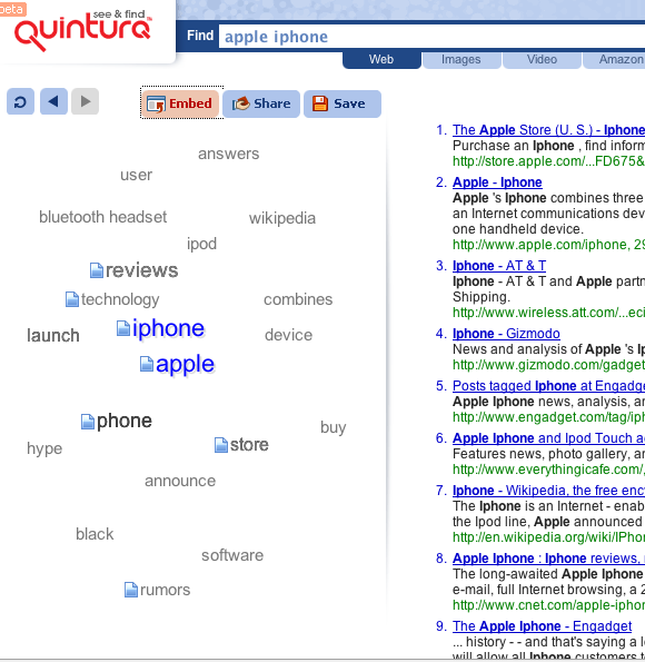
Chapter 4 discusses systems that automatically suggest term refinements for queries, usually by showing an orderly list of up to 8 suggestions, with hyperlinks to add them to the query. These interfaces have been found helpful, especially when a user can augment the query with a single click. The Quintura search engine shows term suggestions in a 2D map layout, or “cloud,” where related terms are shown near one another but arranged somewhat arbitrarily. Mousing over a suggested term causes the others to shift away, and additional similar terms to appear nearby. For example, for the query apple iphone shown in Figure 10.12, neighboring terms include reviews, store, wikipedia, and hype. Placing the mouse over hype causes terms such as sale, preview, and handset to replace those that were previously visible. Selecting the term adds it to the current query. This layout has the advantage over standard views of fluidly updating in response to clicks, but the lack of predictability about where terms of different types appear, most likely resulting in long scanning times and/or confusion on the part of the user.
10.6: Visualizing Query Terms within a Large Document
As discussed in Chapter 5, one of the most successful search interface tropes is the highlighting (in color or boldface) of query terms within retrieved documents and search results. Several approaches have been suggested for how to extend this visualization, both for individual documents (this section) and within retrieval results (next section).
The SuperBook system (Landauer et al., 1993, Egan et al., 1989a, Egan et al., 1989b) (also discussed in Chapter 8) made use of the structure of a large document to display query term hits in context. The table of contents (TOC) for a book or manual were shown in a hierarchy on the left hand side of the display, and full text of a page or section was shown on the right hand side. After the user specified a query on the book, the search results are shown in the context of the table of contents hierarchy. Those sections that contain search hits are made larger and the others are compressed.

As discussed in Chapter 5, some researchers have suggested using the document scrollbar to show the location of term hits. The Read Wear/Edit Wear system (Hill et al., 1992) uses the scrollbar to indicate information such as the amount of time a reader has spent looking at a particular location in the document, or locations of query term hits. Byrd, 1999 suggests applying a different color to each query term, and showing the corresponding colors to the appropriate locations within a scrollbar widget (see Figure 10.13). The Thumbar system (Graham, 1999) uses a similar scrollbar widget on the left hand side and a visualization of hits for the important terms of the document on the right hand side. This idea has been applied in the Chrome Web browser, which uses such a visualization to show where search hits occur within a searched web page.

Hornbæk and Frøkjær, 2001 conducted a study comparing a standard linear view of a document, a fisheye view, and an overview detail view (see Figure 10.14). In the fisheye view, the idea is to reduce scrolling and help the reader focus on their task by shrinking those parts that are estimated to be less important; they can be instantly expanded with a mouseclick. In the overview detail view, a miniaturized view is shown alongside a standard text view; graphical lines indicate text lines and thumbnails indicate images. In both advanced views, query terms are highlighted both in the text itself and in the miniaturized views. Twenty participants were asked to write essays and answer questions based on text from technical articles. All but one participant preferred the overview detail interface and one preferred the linear interface. As has been seen in many studies, the participants did not like the fisheye view; participants also achieved higher grades using the overview detail view, but spent more time in this view in the question answering tasks.
Similarly, as discussed in Chapter 5, Baudisch et al., 2004 experimented with several ways of showing an overview of where the query terms occur throughout a document, including an overview context view and a fisheye view. As found by Hornbæk and Frøkjær, 2001, most participants disliked the fisheye view, but preferred the overview with color keyword highlighting over a standard Web page view with color highlighting alone.
10.7: Visualizing Query Terms within Retrieval Results
There is ample evidence that relevance judgements are aided by seeing which query terms appeared in the retrieved document, their relative proximity, and the words around them (see Chapter 5). Search results listings commonly highlight or apply boldface font to words in the results listing that match the query terms. This section discusses a number of visualizations that have been proposed that go beyond highlighting to explicitly show the locations of query terms in retrieved documents.
10.7.1: TileBars
An early attempt to visualize the relationship between query terms and retrieval results was the TileBars interface (Hearst, 1995). At the time TileBars was introduced, search over full text (as opposed to abstracts) was relatively rare, and most ranking algorithms did not take term proximity into account. One goal of the design was to allow the searcher to see the relative length of the documents, as well as the locations and relative proximity of query terms within the retrieved documents. An algorithm called TextTiling (Hearst, 1994a) preprocessed the texts and subdivided them into sequential subtopic units, further allowing the user to see whether or not their query terms coincided within one logical unit of the text.

In the TileBars visualization (see Figure 10.15), an icon was shown alongside each search result hit which simultaneously showed document length and query occurrence patterns. The visualization represented each document as a rectangle whose length reflected the relative length of the document. The rectangle was further subdivided into columns, representing document segments (paragraphs, sections, or subtopical units as computed by TextTiling). Each query term was assigned its own row within the rectangle, and depth of gray scale was used to indicate the frequency of hits for each term within the subtopic. The pattern of grayscale indicated whether a term occurred as a main topic throughout the document, as a subtopic, or was just mentioned in passing. A further refinement of the idea allowed the user to optionally indicate the query as a set of facets, where each facet received its own entry form and received its own line within the graphic. Each facet of the query consisted of synonyms or related terms representing a given concept. Clicking on a “tile” brought up a view of the document scrolled to the start of the tile, with query terms highlighted in colors corresponding to the colors in the facet's query entry form. Grayscale variation was used in the glyphs instead of color because the perceptual psychological literature suggested this would lead to more accurate interpretation; however subsequent research indicates that the importance of the aesthetic preference for color outweighs the need for accuracy.
Figure 10.15 shows an example. The bar is subdivided into rows that correspond to the query facets. The top row of each TileBar corresponds to “osteoporosis”, the second row to “prevention”, and the third row to “research”. The bar is also subdivided into columns, where each column refers to a passage within the document. Hits that overlap within the same passage are more likely to indicate a relevant document than hits that are widely dispersed throughout the document.

The first document can be seen to have considerable overlap among the topics of interest towards the middle, but not at the beginning or the end (the actual end is cut off). Thus it most likely discusses topics in addition to research into osteoporosis. The second through fourth documents, which are considerably shorter, also have overlap among all terms of interest, and so are also probably of interest. (The titles help to verify this.) The next three documents are all long, and the TileBars graphic suggests they discuss both research and prevention, but do not even touch on osteoporosis, and so probably are not of interest.
10.7.2: Other Iconic Views of Query Term Hits
Several alternative ways to visualize query terms in context have since been proposed. Hoeber and Yang, 2006 developed a simplified version of TileBars in which only one square is shown per query term; term overlap information is not shown, nor is relative document length (see Figure 10.16). A color gradation from yellow to red was used instead of grayscale, and the query terms corresponding to each square are shown vertically at the top of the search results, thus making it easy to keep track of which square corresponds to each query term. In a study with 21 undergraduate computer science majors completing two tasks, Hoeber and Yang, 2006 compared this simplified view applied to Google results (without summaries) to the standard Google interface and another design that attempted to show semantically related documents to those retrieved. No significant timing differences were found, but the visualization was preferred to standard Google, which in turn was preferred to the semantic match algorithm.
A greatly simplified version of the idea was introduced commercially as MatchBars, part of the Xerox Pagis Pro product. A document-shaped icon showed gray-scale colored rectangles corresponding to each query term, but term overlap and document length were not shown. A similar compressed version of the visualization was proposed by Heimonen and Jhaveri, 2005. In a study with computer science students, 11 of the 18 participants did not notice the graphic. Of those who did, the subjective scores indicated that participants did not find the visualization helpful for spotting useful results nor for summarizing results, but did find them useful for eliminating poor results, which is a common finding with visualizations generally.
Anderson et al., 2002 suggested showing relative query term frequencies as a color-coded pie chart beside each search result. A usability study was conducted on a very small collection of 163 documents that were selected so that participants could not judge relevance on title and summary text alone. In addition, participants completed only two queries each, so the results of the study should be viewed with caution. Each of the 101 participants saw one of three conditions: a standard text results listing, a listing with pie charts shown next to text results, and a grid view with pie charts alone. The tasks required finding an explicit answer in the full text view which used color highlighting of query terms along with up and down arrows that made the display jump to the next hit within the page. As seen in other studies, participants liked the color highlighting of keywords in the full text documents and found the ability to jump from term to term within the documents to be helpful. Detailed subjective responses were not provided, but most participants were reported as saying that they understood the visualizations and found them helpful.

(a)

(b)
10.7.3: A Comparison Study of Iconic Visualizations of Retrieval Results
Reiterer et al., 2000 built a system called Insyder that combined several existing visualization ideas and conducted a controlled study comparing participant performance (time and effectiveness) and preferences for three visualizations of results listings Reiterer et al., 2005. The 40 participants (university students and staff) each completed 12 tasks, half of which were fact lookup, and half more intensive information-seeking tasks. The queries were fixed in advance; participants only viewed retrieval results.
In one condition, participants could access only a standard web-style results listing, which acted as the baseline. In the next condition, participants could use only a sortable column view, which contained the same information as the web-style listing, but truncated the summary extracts (see Figure 10.17a). The sortable view also allowed display of retrieved documents within a frame, without replacing the results listing. The third, fourth, and fifth conditions allowed participants to choose between one of the three visualizations and the field-sortable column view.


For the visualizations, Reiterer et al., 2005 implemented (i) a version of TileBars that used color for each facet rather than grayscale (Figure 10.17b), (ii) an improved version of the bar chart visualization suggested by Veerasamy and Belkin, 1996 (Figure 10.18a), and (iii) a scatter plot view that plotted estimated relevance against date, similar to xFIND (Andrews et al., 2001) (Figure 10.18b).
When asked for their favorite view, most participants ranked the field-sortable results first, followed by the TileBars, followed by the web-style listing. The bar chart and scatter plot were not liked. Participants suggested that the visualizations should be given many of the features available in the sortable view, suggesting that using a sparklines-type view (Tufte, 2006) might be useful. When compared to the web-style listing, there were no significant differences for task effectiveness for the other conditions, except for bar charts, which were significantly worse. All conditions had significantly higher mean task times than the web-style listing.
Despite these preference results, search results visualizations are still not commonly used for standard search, but as will be seen in Chapter 11, they are often incorporated into systems intended for analysts.
10.7.4: Visualizing Overviews of Query Terms Hits in Retrieval Results
Another visualization strategy is to display an overview or summary of the retrieved documents according to which subset of query terms the documents contain and share. In this kind of view, the focal icons represent query terms and the spatial positions of the documents indicate how many and which of the query terms they contain. For example, in the VIBE display (Korfhage, 1991, Olsen et al., 1993), a set of documents that contain three out of five query terms are shown on an axis connecting these three terms, at a point midway between the representations of the three query terms in question (see Figure 10.19). In a study, participants did not perform better with VIBE and preferred a text-based display (Morse et al., 1998). Lyberworld (Hemmje et al., 1994) presented a 3D version of the ideas behind VIBE.

The InfoCrystal visualization showed how many documents contain each subset of query terms (Spoerri, 1993), by visualizing all possible relations among N user-specified “concepts” (or Boolean keywords) in a clever extension of the Venn diagram. The goal of the Sparkler visualization (Havre et al., 2001) was to allow users to visually compare results sets for different queries on the same topic (see Figure 10.20). Glyphs representing documents were arranged along a line, where distance from the center indicates degree of relevance to the query. When there were multiple documents with the same relevance score, they were spread out horizontally from the line, forming a visualization of the distribution of relevance scores. The Sparkler for the different queries were arranged along a circle, with each query's visualization assigned a different color. Selecting a document in one sparkler caused its position to be highlighted in the other Sparkler visualizations.
Several researchers have employed a graphical depiction of a mathematical lattice for the purposes of query formulation, where the query consists of a set of constraints on a hierarchy of categories (actually, semantic attributes in these systems) (Carpineto and Romano, 1996, Pedersen, 1993). This is one solution to the problem of displaying documents in terms of multiple attributes; a document containing terms A, B, C, and D could be placed at a point in the lattice with these four categories as parents. However, if such a representation were to be applied to retrieval results instead of query formulation, the lattice layout would in most cases be too complex to allow for readability.

10.7.5: Showing Thumbnail Images of Documents in Search Results
Researchers have noted that although textual summaries are compact and concise and download quickly, they require the user to read and so cannot be scanned as quickly as images. Because the visual system allows a person to “get the gist” of an entire image within 110 milliseconds or less (Woodruff et al., 2001) -- the time it takes to read one or two words -- researchers have often suggested that image-based search results can improve on textual summaries alone.
Image-based summaries are typically derived by creating a thumbnail, or miniaturized image, of the graphical appearance of the original document. Within these images, the layout and graphics can potentially give cues about the type of document and its contents. Furthermore, if a user has seen the document in the past, or one similar to it, they might be able to recognize its thumbnail image. The downside of thumbnails are that the text content in the thumbnails is difficult to see, and text-heavy pages can be difficult to distinguish from one another. Images also take longer to generate and download than text.

Many researchers have experimented with incorporating thumbnails as memory aids in browser history (Ayers and Stasko, 1995, Hightower et al., 1998, Czerwinski et al., 1999, Cockburn et al., 1999, Jhaveri and Raiha, 2005) (see Figure 10.21), but other efforts that attempt to use thumbnails to improve search results have not been as successful. In fact, a study by Czerwinski et al., 1999 showed that after a brief learning period, blank squares were just as effective for search results as thumbnails, although the subjective ratings for thumbnails were high. A subsequent study by Dziadosz and Chandrasekar, 2002 used results listings from Microsoft Search to compare textual summaries alone, thumbnails alone, and textual plus thumbnail summaries. Thirty-five participants were given information seeking tasks such as “you need to know how to remove carpenter ants from your home” and a set of 15 retrieval results in each of the three conditions. For each result, they were asked to first judge if the result was relevant or not based on the document surrogate, and then look at the actual page, and again assess whether or not it was relevant. The participants' initial decision was considered correct if it agreed with their assessment after the page was viewed in full. Thumbnails alone were much more error-prone than the other two conditions; also, the number of errors in text alone versus text plus thumbnails was nearly identical. Additionally, showing thumbnails alongside the text made the participants much more likely to assume the document was relevant (whether in fact it was or not). As seen in other studies in which visual displays are shown alongside textual ones, scan times were longest in the combined condition and shortest in the image alone condition (but the authors did not test to see if the difference was statistically significant).
To address these issues, Woodruff et al., 2001 devised a new type of textually-enhanced thumbnail summary that combines the strengths of the textual and the graphical approaches (see Figure 10.22). Development of the enhanced thumbnails “required significant attention to visual perception and attention management issues” (Woodruff et al., 2001). The enhanced views placed selected textual elements on a separate visual layer from the graphics of the thumbnail, using transparent color overlays to make the text stand out from the image. Since saturated colors attract visual attention, the enhanced thumbnails “washed out” the thumbnail image with a white transparent fill to desaturate its colors and make the textual highlights more prominent. In addition to enlarging the size of the called-out keywords, Woodruff et al. also slightly enlarged textual headings within the thumbnail. They found that making the headings more readable increased the usefulness of the thumbnail, but the change was so subtle that the participants were not consciously aware of the feature.

Woodruff et al., 2001 conducted a study with 18 professional researcher participants, to compare the effects of showing standard text results listings, text results augmented with thumbnail images of documents, and text results augmented with thumbnails enhanced with highlighted query term information. The study also compared four different task types: locate a picture of a given entity, locate the home page of a person not known to them, locate a consumer electronics item for purchase, and locate three or more side effects for a given drug. The timing results were strongly effected by task type. For picture search, highlighted query term thumbnails was equivalent in performance to image thumbnails alone, and both were (unsurprisingly) superior to text summaries. For finding a home page, the enhanced thumbnails tied with text summaries, and both were superior to image thumbnails. For the shopping and side-effects task, the timing differences were not significantly different. Woodruff et al., 2001 also analyzed the number of “false alarms,” meaning how often the participant chose to look at the details for a page that turned out not to be relevant. The false alarm rate for enhanced thumbnails was the lowest or close to the lowest rate for all of the task types. Subjectively, 7 out of 18 participants preferred the enhanced thumbnails, and 6 others preferred them for some tasks. Hence, enhanced thumbnails may be a promising alternative to or augmentation of textual listings.
However, it may be the case that the thumbnails used in these studies were too small to show their true potential. Kaasten et al., 2002 systematically varied the sizes of web page thumbnails shown, and found participants were able to more accurately recognize web pages when larger thumbnails were shown in combination with titles, than with titles alone. When thumbnails were smaller, participants relied on color and layout to recognize the page, and could only make out text at larger image sizes. Kaasten et al., 2002 also found that in their study, 61% of the time thumbnails were seen as very good or good representations of the underlying web page, and 86% were very good, good, or satisfactory representations. The tests were done in the context of Web browser history rather than in a search context, but larger thumbnails may nonetheless change the outcome for subsequent search-based studies.
There has been experimentation in using thumbnails at commercial search engines. A VP at Google related a story in 2003 about testing thumbnails besides search engine results; after 24 hours of testing, the experiment was stopped because it was immediately detected that users were slower on the pages with the thumbnails, in part because fewer hits appeared “above the fold.” The assumption was that slower was worse, without checking first to see if the user experience was better along some other metrics. More recently, the search results interface at SearchMe.com (see Figure 5.9 in Chapter 5) uses large-sized renderings of Web pages along with textual retrieval results, and also offers a “light” version in which large thumbnails are shown alongside standard search results listings. The fast rendering times of the retrieved pages may help overcome some of the timing problems experienced in earlier commercial efforts. It remains to be seen how successful this approach is in practice.
An alternative to showing image thumbnails of documents is to show figures extracted from the document, where available, as done with strong usability results in the BioText system illustrated in Chapter 1.
10.8: Visualizing Faceted Navigation
As discussed at length in Chapter 8, faceted navigation supports flexible movement within category hierarchies, seamless integration of browsing with keyword search, fluid alternation between refining and expanding, and avoidance of empty results sets. Documents within a faceted navigation system are assigned labels from multiple (optionally) hierarchical category systems called facets. Users can navigate by starting with a category from any facet hierarchy, or with a free text search. Selecting a category label from within one facet causes the retrieval results to be narrowed to only those items that are assigned that category, and furthermore causes the other facets' category labels to be updated to show how many of the categories have been assigned to the items in the result set. The user can subsequently choose another category label from any other facet and again narrow the results set, or remove a keyword or category to expand the query.
Chapter 8 discusses standard faceted navigation interfaces such as Flamenco (Hearst et al., 2002) that make use of hyperlinked Web pages and careful graphic design to clearly convey navigation choices and the context of the current search session. This kind of display attempts to maximize the amount of text that is shown while retaining as uncluttered a look as possible. This section discusses ideas that have been put forward for how to show faceted navigation more graphically.

(a)

(b)
Aduna Autofocus is an enterprise search system that has a standard textual faceted navigation interface, similar to that of Flamenco (see Figure 10.23a). It also provides a visualization interface that is a combination of VIBE (Korfhage, 1991) and the Infocrystal (Spoerri, 1993) (discussed above), in which users can both specify query terms and select values from the facets and see graphically how many documents sit at the intersection of different combinations of constraints. In Figure 10.23b, the query terms are cluster*, search, and faceted, and the facet categories selected are of two size ranges, 10-50KB and 50-100KB. The node at the intersection of search, faceted, and 10-50KB is selected, indicating that there are 3 documents satisfying these constraints; those documents are also listed in a sortable-column view in the lower pane. Clicking on the node labeled search would show 15 documents there. According to the Aduna developers (Fluit, 2007), most users of this system find the textual faceted navigation easy and natural to use. The visualization ends up being used primarily by those customers with analytical jobs or tasks, but works well at getting the interest of potential customers.

Much of the success of faceted navigation is due to the use of query previews (Plaisant et al., 1997b, Tanin et al., 2007), which give the searcher a hint of what will happen before they select a link or issue a query. In standard faceted navigation interfaces, as seen in Flamenco and in the Aduna faceted navigation shown in Figure 10.23a, the previews are indicated by simple numerical counts.
Some attempts to visualize faceted navigation focus on showing the counts for the previews in visual form. For example, the Relation Browser system (Zhang and Marchionini, 2005) is similar to Flamenco except rather than showing the counts of each term as a number next to a text label, a graphical bar indicating relative frequency of the category is superimposed over the category label (see Figure 10.24). The white part of the bar indicates the frequency of the category in the collection, while the darker portion shows the proportion of items that match for the query term itself. In the figure, the query is 2002 and the bars show the fraction of the documents assigned to each category labels that also contains the word 2002. A usability study found that searchers were more effective with this interface than with a standard form fill-in interface with drop-down menus. However, this approach was not compared to faceted navigation without the graphical previews.
In fact, independent research results suggest that showing the counts graphically does not improve results. Tanin et al., 2007 performed extensive studies of query previews for navigating hierarchical databases. As have other studies (Plaisant et al., 1997b), this one found that showing the searchers the number of results that fall within different attributes of the database performed better than a form fill-in interface with checkboxes. However, a study with 48 participants found there was no significant difference in timing or preference between a version of the interface that showed bars in addition to numbers and one that just showed the numbers.
The HIBROWSE system (Pollitt, 1997) was an early graphical system that allowed users to navigate a faceted category system. Each facet was shown in a column with a portion of a Boolean query at the top. Query specification was not tightly coupled with display of category metadata; rather, navigating the categories was the focus of the system. The mSpace system (Schraefel et al., 2005) also shows facets in a sequence of columns. The user is allowed to navigate via only one category within each facet at a time, in a restricted version of faceted navigation.
Hutchinson et al., 2006, in designing a digital library interface for young children, found that the hierarchical aspects of faceted navigation were confusing for the users, and so instead showed only leaf-level categories, grouped together spatially, and arranged in a ring format surrounding a central display area (see Figure 10.25). This interface was found to be highly successful. However, because only a few choices could be shown at a time in such a display, the designers adopted a page-type view, requiring children to click to subsequent pages to see more categories choices. Only 1/3 of the children in the study noticed this button, and so in effect the interface works with only a limited number of facets.

The Fathumb (Karlson et al., 2006) interface uses visualization to aid in showing faceted navigation on a small screen, such as for a mobile device (see Figure 10.26). Each facet is represented by a position within a 3x3 grid. Pressing a number on the keypad selects and enlarges the associated facet category; internal tree nodes drill down to the next hierarchical level, while leaf nodes expand to occupy the entire navigation region. Transitions are indicated with animation, and small graphic touches suggest which categories are leaf nodes (solid purple) and a graphical grid indicates where in a facet hierarchy a particular label is. A usability study with 17 participants found strong positive subjective responses for the faceted graphical navigation, and a preference for it over a text entry system on most dimensions. However, participants did not notice the graphic icons embedded within the facets' rectangles (Karlson, 2006).
Visualization of faceted selectors is taken to a playful extreme in the WeFeelFine interface, as shown in Figure 10.27. The goal of this Web site is to graphically express emotions that have been expressed textual throughout the blogosphere, and so the query specification is equally whimsical.


The Cat-a-Cone system (Hearst and Karadi, 1997) showed a category hierarchy in 3D with a link to Web pages displayed in a 3D book representation. When a user selected one category, the Web pages containing that category were shown in the book. The category hierarchy was subsequently modified to show the other categories contained within those retrieval results, retaining their original positions within the hierarchy. However, as discussed in the section on 3D visualization below, this is probably not the most successful way to show this kind of navigation.
10.9: Visualizing Search Results as Clusters and “Starfields”
Chapter 8 describes attempts to use document clustering to improve search interfaces. Many researchers have proposed using text clustering to map documents from their high dimensional representation in document space into a 2D or 3D visual overview. The goal is to derive thematic groups or topics from the text and display them graphically. In most of these views, each document is represented as a small glyph or icon laid out within an abstract space, where proximity suggests thematic closeness or similarity. The layout in these systems make use of “negative space” to help emphasize the areas of concentration where the clusters occur. The functions for transforming the data into the lower dimensional space differ, but the net effect is that each document is placed at one point in a “starfield”-like representation. These visualizations are intended to help searchers get oriented with an initial overview of the contents of the collection, to discern themes or clusters in the arrangement of the glyphs, and to find important documents that might otherwise be missed.
Attempts to employ such graphical displays include BEAD (Chalmers and Chitson, 1992), the Galaxy of News (Rennison, 1994), IN-Spire (Wise et al., 1995, Hetzler and Turner, 2004, Whiting and Cramer, 2002) which includes both 2D and 3D cluster views (see Figures 10.28 and 10.29a), xFIND (Andrews et al., 2001), WebRat (Granitzer et al., 2003), and InfoSky (Granitzer et al., 2004). Lin et al. (Lin et al., 1991, Chen et al., 1998) used Kohonen's feature map algorithm to create maps that graphically characterize the overall content of a document collection or subcollection (see Figure 10.29b).

(a)

(b)

(c)

(d)
A big part of the appeal of visualizing clusters is that the algorithm can be fully automated, and the results can be initially visually striking. Although very frequently proposed, these kinds of graphical overviews of large document spaces have yet to be shown to be useful and understandable for users. In fact, evaluations that have been conducted so far provide negative evidence as to their usefulness. This is not surprising, since as discussed in Chapter 8, text clustering has a number of drawbacks limiting its usability. One of the biggest problems is the imposition of a single organization upon the entire collection, when information represented in text usually is best understood in terms of multi-faceted overlapping concepts or categories. These problems are compounded in visualizations that do not show the titles or text of the documents, thus making it harder still to understand the meanings of the glyphs.
An early study by Kleiboemer et al., 1996 compared textual, 2D, and 3D clustering interfaces, finding that for non-experts the results of clustering were difficult to use, and that graphical depictions (representing clusters with circles and lines connecting documents) were much harder to use than textual representations (for example, showing titles and topical words, as in Scatter/Gather (Cutting et al., 1992) ), because documents' contents are difficult to discern without actually reading some text. The 3D version was the most difficult for the participants.
Russell et al., 2006 compared a scatter plot-like view, with 300 documents organized according to an Latent Semantic Indexing (LSI)-based layout, to a bound collection of paper documents. Twelve participants completed an in-depth analysis task; participants were faster and more accurate with the paper.
Hornbæk and Frøkjær, 1999 compared a thematic map view (see Figure 10.28c) to a Boolean command line interface. In this small study, the six participants used both interfaces on 8 different tasks, conducted over a small collection of HCI research articles (presumably the participants had scientific backgrounds). Multidimensional scaling was used to create a two-dimensional layout of the documents, based on cosine similarity. The most discriminating terms were computed and also shown on the map, placed by computing their midpoint between all the documents on the map in which they occurred. For interaction, all icons for documents and terms that matched a query were highlighted in yellow.
There were no significant effects for number of documents marked as relevant between the two interfaces and no difference in an approximated relevance score. Participants took significantly more time with the visual interface and spent more time shifting between interaction types (querying, scanning titles, reading full text, and viewing the map). Participants assumed adjacency on the map suggested similarity and relevancy, which caused problems when adjacency was not meaningful, and they sometimes got lost and browsed aimlessly. On the positive side, a think-aloud protocol revealed that ideas for query terms came from the map 11% of the time, suggesting that the discriminating terms were useful even if the document cluster-based layout was not (and potentially supports the ideas behind the Quintura term suggestions layout, described above). In subjective responses, the thematic map was favored over the Boolean search by 4 out of 6 participants, who found it more fun and providing inspiration for terms. However, half of the participants expressed difficulty in understanding the map, and this proportion might increase if non-scientists are used in such a study. In addition, the collection was very small and it may be the case that a larger document collection would produce a more difficult to understand map.
More recently, Granitzer et al., 2004 compared the InfoSky visualization (see Figure 10.28a) against a standard tree-style navigation browser. The tree browser significantly outperformed the starfield display for timing on 5 tasks with 8 participants. They then substantially revised the interface, making it easier to see titles and improving the zooming capabilities. They performed a second study with 6 tasks and 9 participants, this time revising the tasks to better suit the visualization at the expense of realism for search tasks (e.g., count the number of documents contained within a subcollection) and still found the tree browser to be faster than the cluster visualization. They did not collect subjective responses.

(a)

(b)
As noted above, Lin et al., 1991 used Kohonen's feature map algorithm to create an overview of a document collection, to be used in search and navigation (see Figure 10.29b). The regions of the 2D map vary in size and shape corresponding to how frequently documents assigned to the corresponding themes occur within the collection. Regions are characterized by single words or phrases, and adjacency of regions is meant to reflect semantic relatedness of the themes within the collection. A cursor moved over a document region causes the titles of the documents most strongly associated with that region to be displayed in a pop-up window. Documents can be associated with more than one region.
A study by Chen et al., 1998 compared navigation of the Yahoo textual hyperlinked category directory to a visualization of clustering results produced by Kohonen learning algorithm. For one of the tasks, participants were asked to find an “interesting” Web page within the entertainment category of Yahoo and of an organization of the same Web pages into a Kohonen map layout. The experiment varied whether participants started in the hyperlinked category directory or in the graphical map. After completion of the browsing task, participants were asked to attempt to repeat the browse using the other tool. For the participants that began with the Kohonen map visualization, 11 out of 15 found an interesting page within 10 minutes. Eight of these were able to find the same page using Yahoo. Of the participants who started with Yahoo, 14 out of 16 were able to find interesting home pages. However, only 2 of the 14 were able to find the page in the graphical map display. This is strong evidence against the navigability of the display and certainly suggests that the simple label view provided by Yahoo is more useful. However, the map display may be more useful if the system is modified to tightly integrate querying with browsing. Many found the single-term labels to be misleading, in part because they were ambiguous (one region called “BILL” was thought to correspond to a person's name rather than currency).
The participants did prefer some aspects of the map representation. In particular, some liked the ease of being able to jump from one area to another without having to back up as is required in a hierarchical directory, and some liked the fact that the maps have varying levels of granularity. Some participants expressed a desire for a visible hierarchical organization, others wanted an ability to zoom in on a subarea to get more detail, and some users disliked having to look through the entire map to find a theme, desiring an alphabetical ordering instead. Most of these desired but missing features are met by faceted navigation systems.
Another variation on visualizing the results of clustering is to place the documents for each cluster into nested sets of circles; selecting a circle navigates in to subclusters, as done in the Grokker system (see Figure 10.30). Grokker hides the text and shows only graphics initially, so users must first decide which cluster to explore, and since there is very little text in the visualization. In a study comparing it to a textually represented clustering system (Vivisimo), Rivadeneira and Bederson, 2003 found that participants did not like the Grokker interface and preferred that of Vivisimo, although there we no significant differences in terms of speed and accuracy. They observed an advantage of the textual display: participants could look at search results before exploring the clusters, so they could decide when clusters would be useful; this was seen to be a useful feature in a study by Käki, 2005b as well (see Chapter 8).

Another common way to attempt to show inter-document is to show retrieved documents in node-and-link networks based on inter-document similarity (Fowler et al., 1991, Thompson and Croft, 1989, Swan and Allan, 1998). Swan and Allan, 1998 implement a version of this idea in which documents are laid out according to a spring embedding algorithm based on similarity within a vector space measure. Results of a usability study were not positive (Swan and Allan, 1998) ; for subjective responses, although librarians preferred the traditional system, general users preferred the experimental visualization system. Other systems display inter-document similarity hierarchically (Maarek and Wecker, 1994, Allen et al., 1993).
10.10: 3D Visualization in Search
Several researchers have experimented with 3D views of information spaces. Typically in such displays, the view can be rotated and the image can be viewed from all angles. Some interfaces described as 3D are better labeled as “2-and-a-half-D,” since they cannot be moved around in all dimensions, but instead use perspective and other techniques to make them look less flat than standard 2D.
It may be the case that 3D interfaces will become more successful as the technology improves, but for information processing tasks, 3D has been found to be inferior, or at best equivalent to 2D or textual interfaces when usability comparisons are done. For example, Tory et al., 2007 compared point-based displays (like scatter plots) to 2D and 3D information “landscapes” representations for visual search tasks on non-spatial information, such as ThemeViews shown above in Figure 10.29. They found that point-based spatializations were superior to landscapes, and 2D landscapes were superior to 3D landscapes. Westerman and Cribbin, 2000 compared 2D and 3D representations of document space and found that “for the purposes of information search, the amount of additional semantic information that can be conveyed by a three-dimensional solution does not outweigh the associated additional cognitive demands.”
Sebrechts et al., 1999 asked 15 participants to complete 32 search tasks using one of three interfaces. The first was a textual interface depicting document titles organized into clusters labeled with concept names and marked with colors. The second was a 2D interface in which the clusters were shown as bar charts in rows and columns along latitude and longitude lines. The third was a 3D rendering of the second. The tasks were not standard search tasks; rather they were artificial tasks designed to benefit a visual interface, such as marking a specific article with a color, finding articles marked earlier, or finding specific clusters. Despite this, the study found that the textual view was significantly faster than the other two, and that 2D was faster than 3D. As participants became more familiar with the system and the collection, the times became more similar, and those participants who had a lot of computer experience did as well with 3D as with text. The color marking indicating cluster identity was the most often used visual component, making use of the preattentive property of color matching. One problem with the visual displays was the lack of legibility of the text. As seen in all studies of this kind, it is important to be able to read the text in order to make sense of the contents behind the icons.
Cockburn and McKenzie, 2000 compared an 3D file browser interface to a 2D standard file browser for file location efficiency, finding that the 3D participants took substantially longer to find files, and that performance worsened as the size of the hierarchy increased. However, they saw some evidence that participants got a better overview using the 3D display. In a followup study, Cockburn and McKenzie, 2001 compared what they called 2D and 3D versions of document management systems and found that participants were faster at storing and retrieving using the 2D display, but not significantly so. In this case, subjective assessments favored the 3D display. However, in this study the 3D display was more like an enhanced 2D display. To address this discrepancy, they repeated the study, this time using physical cards that participants manipulated along either a flat plane or in three dimensions, and using virtual versions of the display that varied from 2D to 2.5D to a more realistic 3D display (Cockburn and McKenzie, 2002). Time taken to retrieve pages significantly increased from 2D to 2.5D to 3D in both physical and virtual conditions, and subjective assessment became less favorable as the dimensions increased.
10.11: Conclusions
This chapter has described attempts to use information visualization to go beyond the standard user interface visual cues to improve search. It began with a brief exposition on principles of information visualization and the human perceptual system, and a summary of interactive techniques that are often used in visualization interfaces. This was followed by a discussion of the effects of data type on design choices that can be made for visualizing information, and a discussion of why it is so difficult to present nominal (textual) data graphically. The rest of the chapter discussed the application of visualization techniques to different aspects of the search process, including query specification, retrieval results, and getting an overview of the collection. Another topic was visualization of search results organization, including its application to faceted navigation and clustering techniques. Finally, efforts to use 3D in search interfaces were touched on.
As stated in the introduction to this chapter, information visualization has not yet proven itself for search interfaces. It may be that the best uses have not yet been discovered, or it may be the case that the nominal nature of textual information renders visualization problematic for this particular application. The next chapter describes the application of visualization to text for more analytical purposes, where it seems to be better suited, if only for a small audience of users.