Ch. 1: The Design of Search User Interfaces
1.1: Keeping the Interface Simple
The job of the search user interface is to aid users in the expression of their information needs, in the formulation of their queries, in the understanding of their search results, and in keeping track of the progress of their information seeking efforts.
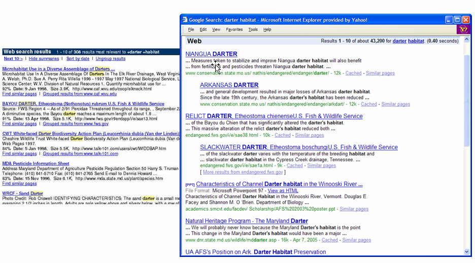
However, the typical search interface today is of the form: type-keywords-in-entry-form, view-results-in-a-vertical-list. A comparison of a search results page from Google in 2007 to that of Infoseek in 1997 shows that they are nearly identical (see Figure 1.1). Why is the standard interface so simple? Some important reasons for the relative simplicity and unchanging nature of the standard Web search interface are:
- Search is a means towards some other end, rather than a goal in itself. When a person is looking for information, they are usually engaged in some larger task, and do not want their flow of thought interrupted by an intrusive interface.
- Related to the first point, search is a mentally intensive task. When a person reads text, they are focused on that task; it is not possible to read and to think about something else at the same time. Thus, the fewer distractions while reading, the more usable the interface.
- Since nearly everyone who uses the Web uses search, the interface design must be understandable and appealing to a wide variety of users of all ages, cultures and backgrounds, applied to an enormous variety of information needs.
Designers of Web search interfaces have learned that in order to be able to successfully serve their highly diverse user base, they must be very careful about any complexity that they introduce. Almost any feature that a designer might think is intuitive and obvious is likely to be mystifying to a significant proportion of Web users.
To illustrate this point, despite the simplicity of the search results listings shown above, research suggests that even this spartan presentation is too complex for some people. A study of elderly users by Aula and Käki, 2005 found that further simplifying the list of results reduced errors substantially. And research by Hargittai, 2004 showed that some people do not understand even the very basics of keyword specification. Unlike most studies that involve university-educated participants exclusively, Hargittai obtained a random sample of 100 participants representative of the population of a county in New Jersey according to socio-economic factors. Hargittai, 2004 found that, in addition to not really understanding keyword queries, many participants confused the address bar with the search entry form, and vice versa (the latter effect is common, as can be inferred from the fact that the most frequent queries for all search engines are google and yahoo). Some participants confused the syntax of the address bar with the syntax of query terms, placing spaces within URLs in the address form, as in www.new york times.com and time warner.com, or omitting all spaces from their keywords, resulting in queries like presidentalcampaign2000, employmentopportunities, and fordescort.
Another study by Muramatsu and Pratt, 2001 with 14 participants found that most people had strong misconceptions about simple Boolean operations. When comparing search engines that automatically applied AND versus OR to query terms, some assumed the ANDing search engine indexed a smaller collection; most had no explanation at all. When receiving empty results for the query to be or not to be, two thirds could not explain this phenomenon in a way that remotely resembled stopword removal. For term order variation in queries (for example, boat fire vs. fire boat), two thirds did not expect the results to differ.
Although today's standard search is a big improvement in usability over older command-line based Boolean systems, there is evidence that keyword querying is not initially intuitive. In fact, the literature suggests that people who are new to using search engines tend to start by asking a natural language question (Bilal, 2000, Schacter et al., 1998). Novice searchers must learn to expect that a query will not yield immediately usable results, and that they must scan search results lists, navigate through Web sites and read through Web pages to try to find the information they seek. A study by Pollock and Hockley, 1997 found that, for novice searchers, the notion of iterative searching was unfamiliar. Some study participants assumed that if their first attempt failed then either they were incapable of searching or the system did not contain information relevant to their interest.
Given the difficulty that some users experience in using relatively simple interface elements, it is perhaps not surprising that attempts to improve search via more complex interfaces have for the most part not been widely adopted. There are, however, some successful innovations in search interfaces which are becoming widely used; some of these are discussed in the design guidelines sections below. First though, a historical interlude explains the evolution of search interfaces over time. This is followed by a brief summary of how interface design is done in practice, and then a discussion of design guidelines for search user interfaces.
1.2: A Historical Shift in Search Interface Design
The story of search user interfaces is complicated by a radical shift that occurred after the Web became a worldwide phenomenon. Before the Web, computerized information retrieval was usually done only by members of a narrow demographic: highly educated users, such as paralegals, librarians and other search intermediaries, and journalists. These people searched over highly specialized, high-quality, information-oriented text collections such as bibliographic records for university libraries, legal cases and opinions, and newswire articles. Often the providers of search access to these collections had monopolies on the content, and therefore did not feel the pressure of competition to provide improved interfaces for that content.
By contrast, the Internet is now accessed by 75% of the U.S. adult population, and 91% of those who use the Internet use Web search engines (Pew, 2008b). The content of the Web differs from that of earlier systems in several important ways. Older systems usually did not allow search over full text; rather, the user could only search over titles and perhaps abstracts and other descriptive metadata. Search was usually used to find the name and location of a source containing this information, and then a physical paper copy would have to be obtained to see the full text. By contrast, most of what is available on the Web is the full text itself; the desired information is often immediately accessible.
The content available on the Web is vastly broader than that of older systems, and in addition to expository text, contains the equivalent of brochures and local newsletters, official information for companies and all kinds of organizations, information that can be used directly, such as guitar chords and knitting patterns, how-to information, hobbyist guides, and so on. The Web can be used to see the answers to questions, such as what is the population of Madagascar, directly. This was not usually possible in the older systems, which acted as gateways to more detailed information that was available only offline.
Older systems were developed before bitmapped (graphical) displays were commonplace, and so were based on command-line interfaces. These usually required complex combinations of operators -- which had to be memorized -- and Boolean syntax for query specification. Very few members of the lay public understand Boolean syntax and even fewer are willing to learn command languages. The lack of competitors with access to the content, plus an installed base of users who knew the old systems, probably slowed the adoption of modern user interface conventions. Another important difference between old and new search systems is that older retrieval systems often charged for use (in terms of number of queries issued, number of results returned, or amount of time used), whereas Web search has always been free of charge.
These contrasts -- highly educated and trained users verses everyone as a user; high-quality, expensively edited expository text versus a huge variety and multiplicity of information types, search over document metadata (titles and abstracts) rather than over full text, TTY displays versus graphical displays, and expensive usage controlled by one provider versus free usage provided by a multiplicity of search providers -- help explain the differences seen in search user interfaces before and after the Web. These differences will be revisited throughout this book.
1.3: The Process of Search Interface Design
An important quality of a user interface (UI) is its usability, a term which refers to those properties of the interface that determine how easy it is to use. Shneiderman and Plaisant, 2004 identify five components of usability, restated by Nielsen, 2003b as:
- Learnability: How easy is it for users to accomplish basic tasks the first time they encounter the interface?
- Efficiency: How quickly can users accomplish their tasks after they learn how to use the interface?
- Memorability: After a period of non-use, how long does it take users to reestablish proficiency?
- Errors: How many errors do users make, how severe are these errors, and how easy is it for users to recover from these errors?
- Satisfaction: How pleasant or satisfying is it to use the interface?
How are interfaces designed in order to attain the goals of usability? Despite the newly recognized importance of usability and user interface design, it is nonetheless surprisingly difficult to design highly usable interfaces. The field that encompasses interface design, as well as understanding how people interact with information and technology, is called Human-Computer Interaction, or HCI (Shneiderman and Plaisant, 2004). Among many other activities, this field has led to the development of a design technique called user-centered design whose goal is to lead to the development of usable designs.
In user-centered design, decisions are made based on responses obtained from target users of the system. (This is in contrast with standard software practice in which the designers assume they know what users need, and so write the code first and assess it with users later.) In user-centered design, first a needs assessment is performed in which the designers investigate who the users are, what their goals are, and what tasks they have to complete in order to achieve those goals. The next stage is a task analysis in which the designers characterize which steps the users need to take to complete their tasks, decide which user goals they will attempt to support, and then create scenarios which exemplify these tasks being executed by the target user population (Kuniavsky, 2003, Mayhew, 1999).
Once the target user goals and tasks have been determined, design is done in a design-evaluate-redesign cycle consisting of creating prototypes, obtaining reactions from potential users, and revising the designs based on those reactions. This sequence of activities often needs to be repeated several times before a satisfactory design emerges. Evaluation at this phase can often achieve useful results by testing with only a few participants, so the evaluation method used at this point in the design space is often referred to as “discount” usability testing (Nielsen, 1989b). After a design is testing well in discount or informal studies, formal experiments comparing different designs and measuring for statistically significant differences can be conducted.
This iterative procedure is necessary because interface design is still more of a practice than a science. There are usually several good solutions within the interface design space, and the task of the designers is to navigate through the design space until reaching some “local optimum.” The iterative process allows study participants to help the designers make decisions about which paths to explore in that space. Experienced designers often can begin the design near a good part of the solution space; less experienced designers need to do more exploration. Designing for an entirely novel interaction paradigm often requires more iteration and experimentation. Evaluation is part of every cycle of the user-centered design process. Because it is such an important topic, it receives a chapter of its own in this book (Chapter 2).
1.4: Design Guidelines for Search Interfaces
Researchers and practitioners in the field of Human-Computer Interaction have proposed dozens of sets of guidelines for successfully building user interfaces. Some authors have proposed guidelines for search interfaces specifically; an influential paper by Shneiderman et al., 1997 specifies eight design desiderata for search user interfaces generally (re-ordered below):
- Offer informative feedback.
- Support user control.
- Reduce short-term memory load.
- Provide shortcuts for skilled users.
- Reduce errors; offer simple error handling.
- Strive for consistency.
- Permit easy reversal of actions.
- Design for closure.
These guidelines provide good advice for search UI design. However, design guidelines can be difficult to follow, for a number of reasons. First, they are under-specified; they do not usually say how to achieve the guideline's goals. Second, meeting one guideline often conflicts with meeting another. For instance, in order to satisfy the consistency rule, if every results page must look identical, then an interface that shows query term suggestions in retrieval results must show a label stating “no feedback terms available” when it has no suggestions to make. This message would keep the interface consistent, but at the cost of distracting users with unnecessary information. Third, any list of guidelines is incomplete. For instance, the list above omits Nielsen, 1993's commonly stated guideline of “speak the user's language,” which urges designers to adopt concepts and language familiar to users where possible. And finally, for any given interface, some guidelines will be superfluous.
Despite these drawbacks, the following sections elaborate in more detail about how some of these design guidelines should be applied to search interfaces. These guidelines and recommendations are informed by a study of the search interface literature, by cognitive considerations in search, and by a decade of experience designing such interfaces. The substance behind most of these is discussed in more detail in later chapters of this book.
It should be noted that these guidelines are specific to search interfaces; there are many other very important design guidelines for other aspects of interface design, and a number of excellent books to refer to for them (e.g., (Nielsen and Loranger, 2006, Cooper et al., 2007) ).
1.5: Offer Efficient and Informative Feedback
A bedrock principle of interface design is to provide the user with feedback about the status of the system and how that relates to the user's interactions with the system. A familiar example of interface feedback is the hourglass timer icon that is typically shown in a graphical operating system interface to indicate that the user has to wait while an application is launching or saving a large file.
Because the search task is so cognitively intensive, feedback about query formulation, about the reasons the particular results were retrieved, and about next steps to be taken is critically important. The subsections below describe important feedback indicators for search interfaces.
1.5.1: Show Search Results Immediately
Numerous studies show that an important search interface design principle is to show users some search results immediately after their initial query or navigation step (Hutchinson et al., 2006, Plaisant et al., 1997a, Käki, 2005a). This information can be shown alongside other navigation aids, but at least a few initial results should be shown. This helps searchers understand if they are on the right track or not, and also provides them with suggestions of related words that they might use for query reformulation. Many experimental systems make the mistake of requiring the user to look at large amounts of helper information, such as query refinement suggestions or category labels, before viewing results directly. Information visualization interfaces that show documents as dots or icons in a two-dimensional space suffer from poor usability because the searcher cannot see the text of the titles and document surrogates (Hornbæk and Frøkjær, 1999, Granitzer et al., 2004).
1.5.2: Show Informative Document Surrogates; Highlight Query Terms
Most search results listings today show a vertical list of results, each containing information about the document and why it was retrieved, such as the title, the URL, and a textual summary; this information is referred to as the document surrogate. The documents' summaries (also called snippets, extracts, and abstracts) are typically a few lines of text extracted from the retrieved documents.
An important form of feedback in search results listings is to include the terms from the query in the document surrogates in order to show how the retrieved document relates to the concepts expressed in the query. Early Web search interfaces showed the first few lines of the document in the summary, but today, summaries are designed to show the query terms in the context in which they occur in the document. Research shows that summaries are most informative if they contain the query terms shown in their context from the document (Tombros and Sanderson, 1998, White et al., 2003a).
Query term proximity information can be quite effective at improving precision of searches (Hearst, 1996, Clarke et al., 1996, Tao and Zhai, 2007). According to a large study by Clarke et al., 2007, when possible, all the query terms should appear in the search result surrogate, but if all of the query terms are present in the title for the hit, they need not appear in the summary, which can then include other useful relevance information. Clarke et al., 2007 also found that query terms appearing in the URL can be a useful cue, but that length and complexity of the displayed URL should be reduced where possible.
It has also been shown that visually highlighting query terms can be a useful feature for search interfaces (Landauer et al., 1993, Lesk, 1997, Marchionini, 1995, Aula, 2004). Term highlighting refers to altering the appearance of portions of text in order to make them more visually salient, or “eye-catching”. Highlighting can be done in boldface, reverse video, by displaying a colored background behind each occurrence of a query term, assigning a different color to each term. This helps draw the searcher's attention to the parts of the document most likely to be relevant to the query, and to show how closely the query terms appear to one another in the text. However, it is important not to highlight too many terms, as the positive effects of highlighting will be lost (Kickmeier and Albert, 2003).
There is an inherent tradeoff between showing long, informative summaries and minimizing the screen space required by each search hit. There is also a tension between showing fragments of sentences that contain all or most of the query terms and showing coherent stretches of text containing only some of the query terms. Research is mixed about how and when chopped-off sentences are preferred and when they harm usability (Aula, 2004, Rose et al., 2007). Research also shows that different results lengths are appropriate depending on the type of query and expected result type (Lin et al., 2003, Guan and Cutrell, 2007, Kaisser et al., 2008), although varying the length of results has not been widely adopted in practice.
Figure 1.2 shows a screenshot from the BioText interface for searching over bioscience literature in which several kinds of document surrogate information are used (Hearst et al., 2007). Figures extracted from the articles are shown alongside each search hit, query terms are highlighted (in title) and boldfaced (in abstract and full-text excerpt), and the user can vary how much information is shown in the text excerpts by selecting or deselecting checkboxes for showing the abstract and full-text excerpts. The figure shows a case in which the second word in the query appears in the body of the article, but not in the title or abstract.

1.5.3: Allow Sorting of Results by Various Criteria
Another effective form of feedback in the display of search results allows for the dynamic sorting of search results according to different ranking criteria (e.g., recency, relevance, author, price, etc.). An effective interface for displaying results sortable along several dimensions at once uses a sortable columns format, as seen in email search interfaces, some product search, and some bibliographic search (see Figure 1.3). With this view, users can sort results according to different criteria, while being able to visually compare those criteria, because the changes are directly visible (Reiterer et al., 2000, Cutrell et al., 2006b). This kind of view is typically more effective than showing choices hidden behind drop-down menus. Grouping search results by categories is also an effective form of feedback, as discussed in the section below on integrating navigation and search.

1.5.4: Show Query Term Suggestions
After a user has issued a query, it has been shown useful to provide feedback in the form of automatically-generated query term suggestions and refinements. These include spelling correction suggestions as well as suggestions of related or alternative query terms. The phrase term expansion is usually applied to tools that suggest alternative wordings. Usability studies are generally positive as to the efficacy of term suggestions when users are not required to make relevance judgements and do not have to choose among too many terms (Bruza et al., 2000, Anick, 2003, White et al., 2007, Divoli et al., 2008). A study of session logs of the Dogpile Web search engine showed found that 8.4% of all queries were generated by the reformulation assistant provided (Jansen et al., 2007b). Figure 1.4 shows an example of a term expansion interface provided by Yahoo.
A related recent development in rapid and effective user feedback is an interface that suggests a list of query terms dynamically, as the user types the query, and that match the query or are semantically similar to it in some way. (This is sometimes referred to as incremental search.) For example, typing the letters ba on the Ask.com Web search engine shows query suggestions including baby names, barnes and nobel, barack obama, and bank of america. Adding an n to make a query of ban changes the suggestions to include banana republic, bankruptcy, and bangladesh. The query suggestions are often tailored to the underlying information collection. For example, a site that shows statistics about different airports (flightstats.com) dynamically adjusts airport names as the user types in letters. Beginning with s shows hits not only on airports whose three-letter code begins with “s”, but also for airports whose city name or country name begins with this letter. (These include Palma Mallorca airport in Spain, Suvarnabhumi airport in Bangkok, and SFO in San Francisco, CA.) Adding the letter f eliminates all of these except SFO, but shows less frequented airports such as Sfax El Maou airport in Tunisia. Dynamic query term suggestions are a promising intermediate solution between requiring the user to think of terms of interest (and how to spell them) and navigating a long list of term suggestions.

Returning to Figure 1.4, this search assistance tool uses a “sliding tray” that opens automatically based on heuristics corresponding to user behavior (Anick and Kantamneni, 2008). For instance, if the user pauses in typing before hitting the Enter key, the tray will slide out showing dynamic query suggestions. The view shown here appears after a query has been entered, and the left hand column of suggestions in Figure 1.4 shows term suggestions that are related to the query.
A log study on 100,000 visitors to the Yahoo site over 17 weeks found that this tool was heavily used, with 30% of those exposed to it choosing to interact with it during the first exposure, increasing to 37% by the 17th week (Anick and Kantamneni, 2008). There was also a high degree of iterative interaction with the tool. However, a small eye-tracking study showed that the interface includes a design error that is often seen in experimental search interfaces (Anick and Kantamneni, 2008). In this error, the interface showed two kinds of hints next to each other. Users are unlikely to understand the difference in meaning between the types of suggestions in the left hand and right hand columns, because the suggestions themselves are similar and users may not know, or need to know, the difference between dynamic suggestions and after-query suggestions. (A smaller problem is that only one column has a visible label.) A better design would be to show the dynamic suggestions as the query is being typed, and then replace these with the related term suggestions after the query is entered (via hitting the return key or selecting the Search button). When the user resumes typing, the dynamic suggestions should replace the related terms.
It is generally not a good idea to make people remove terms to increase relevance. For instance, Ahn et al., 2007 found that keyword removal caused about four times more harm than adding keywords for building user profiles. The essence of the problem is that the space of what is not relevant is far larger than the space of what is relevant. This is not to say that adding a “NOT” operator to a query is never useful, but rather that an interface should not be founded on the idea that users will remove irrelevant terms or documents.
1.5.5: Use Relevance Indicators Sparingly
In the past it was common for search engines to show a numerical score or graphical bars or icons such as a row of stars alongside the document surrogate to indicate the relevance score for the documents (Shneiderman et al., 1997). However, these have fallen out of favor, most likely because the meaning of the relevance score is opaque to the users (White et al., 2007) , and the vertical position on the page is a strong and effective signal of the relative relevance of the results. It should be noted that graphical indicators of other kinds of information -- such as using a line of stars to indicate how favorably reviewed an item is -- can be quite useful.
Innovative visualization techniques for graphically showing the distribution of the query terms within the retrieved documents have been developed (Hearst, 1995, Reiterer et al., 2005, Meredith and Pieper, 2006), but are used primarily in text analysis interfaces rather than in standard search.
1.5.6: Support Rapid Response
For search interfaces, rapid response time is critical to support effective feedback. A perceivable lag interrupts peoples' thought processes; rapid response allows searchers to work with “flow.” Providing highly responsive interactive results is important for dynamic search results suggestions, and fast response time for query reformulation allows the user to try multiple queries rapidly. If the system responds with little delay, the user does not feel penalized for trying inaccurate or general queries that are “in the ballpark” but not quite right. This allows the user to rapidly move closer to their goal and learn more about their search topic with each query.
Research suggests that when rapid responses are not available, search strategies change. For instance, a search engine for users in the developing world in which the round trip for retrieval results can be a day or more requires accurate, thoughtful query formulation (Thies et al., 2002). It should also be noted that for some specialized search applications in which the results are the final desired information, users are not unduly penalized by having to wait, such as for systems that search for airline flights. These sites wisely tend to show a graphical animation while processing the user's request, to reduce feelings of impatience.
1.6: Balance User Control with Automated Actions
Greene et al., 2000 write that “Users prefer comprehensible, predictable, and controllable environments.” This is a good design guideline in general. However, in the design of technology, there is often a tradeoff between the system taking control for the user versus the user being in control of details of the system's behavior. For example, millions of people enjoy the ease and convenience of taking snapshots with point-and-shoot digital cameras, where there is no need to fuss with the focus, shutter speed, or lighting because the camera automatically figures out the settings. However, on those occasions in which the user wants to override the camera's default behavior (say, in very low light), it can be difficult to quickly determine how to accomplish this. Similarly, in the design of search algorithms and interfaces, there is a delicate balance between clever but opaque operations that correctly anticipate searcher's needs most of the time and less powerful or less effective designs that are however easily understandable and give the user control over system behavior.
Below are two important types of search interface design decisions that must consider the tradeoff between opaque system control and transparent user control: results ordering and query transformations.
1.6.1: Rank Ordering in Web Search
The most prominent case of opacity in the operation of search interfaces is the rank ordering of retrieval results.
As discussed above, most users have little understanding of how search technology works, and the mechanisms behind search results ordering are especially mysterious. Early Web search engines used a variation of vector-based statistical ranking, which is difficult to understand, in part because the system might show a document that has many hits on a rare term higher than a document that contains a few hits on every term in the query (Lake, 1998). Furthermore, Web queries usually contain only a few words, while statistical ranking was originally designed for paragraph-length queries.
Sometime in the late 1990's, the Hotbot search engine introduced conjunctive (AND-based) query analysis for Web search ranking, meaning that every word in the query must be present in the document in order for that document to be shown (Glossbrenner, 1999). This behavior is more transparent than the statistical approach because the searcher knows that every page retrieved contains at least one instance of every word they typed. Behind the scenes, the system may give more weight to pages in which the terms occur more frequently, but the user does not need to know that detail in order for the retrieval strategy to be understandable. Also in the late 1990's, Google improved conjunctive ranking by assigning higher weight to documents in which query terms co-occurred in close proximity to one another, which had been shown by others to improve precision (Hearst, 1996, Clarke et al., 1996), and which has the advantage of producing more useful document summaries (Tombros and Sanderson, 1998). Google also incorporated a “popularity” measure, PageRank (Page et al., 1998). The fact that popular web pages appear higher in the results is understandable for lay users even though the algorithm for computing popularity would not be widely understood.
Although AND-based ranking has been quite effective, today the pendulum is swinging the other way. Sophisticated users are issuing longer queries, and the rise of natural language search engines is encouraging longer and more complex queries. As queries get longer, it becomes necessary to relax the constraint that all words appear in the retrieved documents, or at least to downweight their importance in proximity to the content words. Today, a user can enter a query typing while recovering from clavical surgery into Google and it successfully finds relevant documents by ignoring the role of the syntactic structuring words while and from and returning pages in which recovering occurs only in hyperlinks pointing to the page. In order for this kind of sophisticated processing to avoid the confusing behavior of earlier statistical algorithms, the lack of transparency must be offset by the relevance and meaningfulness of the returned results.
Perhaps the most understandable and transparent way to order search results is according to how recently they appeared. In fact, for some information collections, such as news, chronological ordering can be preferred over rank ordering. Dumais et al., 2003 found that users preferred chronological order over rank order when searching over their personal information. Bioscience researchers often prefer to see scientific articles presented according to recency. However, for web search, relevance ranking is a necessity because time of first appearance for a Web page is of secondary importance in most cases.
1.6.2: Query Transformations
Another important issue in the tradeoff between system cleverness and user control lies with query transformations. Some search engines make subtle changes to queries to improve results. For example, Microsoft's web search automatically converts words like vs. to versus. The lack of user control in this feature is mitigated by the fact that this transformation nearly always matches the searcher's intention. As another example, Google returns pages that contain people's names for which the middle initial is missing, even if the original query specifies the middle initial. Although a useful feature, this could frustrate a searcher who is trying to distinguish between two people with similar names.
A classic case of system behavior that is opaque to system users is the elimination of stopwords from user queries. (Stopwords are the most common words in the language, usually what linguists call “closed-class” words in that new ones rarely enter the language. Examples from English are articles such as a, an, the and prepositions such as in, on.) In a famous example in the early days of Web search, a searcher who typed “to be or not to be” in a search engine would be shocked to be served empty results. In 1996, a review of eight major search engines found that only AltaVista could handle the Hamlet quote; all others ignored stopwords (Peterson, 1997, Sherman, 2001). (Stopword elimination is common in statistical ranking systems for which a paragraph-length query is assumed; not indexing stopwords by position results in significant savings in indexing time and disk space.) Today, this problem is solved on all the major Web search engines.
The application of morphological analysis (stemming) has long yielded mixed results in the information retrieval literature: in some cases it helps, and in others it degrades search results. From a user expectations perspective, on the one hand, searchers express surprise if the computer is not “smart” enough to do simple transformations, such as automatically converting woman's rights in the query to match women's rights in documents (Twidale and Nichols, 1998). But on the other hand, if morphological analysis is done too aggressively, the meaning of the query can be distorted. For example, Google converts the word typing to type in the query typing after clavicle surgery, which yields some results that do not discuss the act of typing. These effects are mild so long as the stemming is applied lightly, and a mix of the word forms is allowed to contribute to the results. But if the system consistently overrules the user's intention, the user may become justifiably frustrated.
In the case of automatic spelling suggestions, the system should offer the choice to the user without forcing an acceptance of an alternative spelling, in case the system's correction does not match the user's intent. But on the other hand, if the user makes a blatantly incorrect typographical error, it can be annoying to see only irrelevant results, and the system may return low-quality Web pages. To balance this tradeoff, when encountering what the system believes is an erroneously spelled query term, many Web search engines show some hits that contain words that they guess are the correct spelling interwoven with other hits that contain the purportedly incorrect spelling.
1.7: Reduce Short-Term Memory Load
The interface guideline “reduce the user's memory load” is very important for information-rich system interfaces. The main idea behind this heuristic is to show users relevant information rather than require them to remember or keep track of it. Several methods applicable to search interfaces are described in the subsections below.

1.7.1: Suggest the Search Action in the Entry Form
A useful interface trope that has arisen recently is, rather than showing a blank entry form, the designer places text within the entry form to indicate what action will result from using that form. This text is usually shown in grayed-out font, to signal that it is intended to be replaced by the user's text. (The text within the form disappears when the user clicks in the form.) This is especially useful in search interfaces as a way to indicate that the user would be searching over an alternative collection, or when attempting to provide a “search within these results” feature. The lower right hand corner of Figure 1.5 shows an example from the Web site of The New York Times, that makes it clear that a query in that entry form searches over the user's saved pages, as opposed to searching over the site as a whole. This design works in part because the user must look at the text in the entry form in order to select the form and begin typing; it demands the user's attention, but is not distracting because it provides the information exactly at the point in the user's workflow that it is needed at.
In the upper right hand corner is shown a more standard approach to allowing users to choose between collections. It shows a search box with a radio button that selects which collection to search over. Most studies suggest that users do not notice or change the choices in this type of interface, in part because they do not notice the option while they are entering their query. A radio button or other choice selector, such as a drop-down menu, is more likely to be noticed after the query is issued when retrieval results are being viewed. Thus, selectors for sorting the search results (by date, by price, etc.) after the query are used with some frequency.
1.7.2: Support Simple History Mechanisms
Research shows that people are highly likely to revisit information they have viewed in the past and to re-issue queries that they have written in the past (Jones et al., 2002, Milic-Frayling et al., 2004). In one large study, 40% of people's search results clicks were on pages that they had clicked on before over the course of a year, with 71% of these using the identical query string as before (Teevan et al., 2006a). In a survey associated with this study, 17% of interviewees reported “not being able to return to a page I once visited” as one of the “biggest problems in using the web.” Therefore, allowing search over recently viewed information can improve a user's productivity (Dumais et al., 2003). Web browsers, as opposed to search engines, can provide much of this functionality. For example, the Chrome Web browser supports information revisiting by showing a grid of thumbnail images representing a user's most frequently visited web pages, and the drop-down menu from the many browser Web address bars shows recently visited pages. Search engines themselves can provide query history, as well as history of previously selected pages if the user agrees to having that information recorded. The PubMed bioscience journal service shows recently issued queries and visited documents in a simple history display (see Figure 1.6). Similarly, many shopping Web site show recently viewed items in a graphical form. Thumbnail images have also been experimented with in search results listing, both for reminding searchers of previously visited pages and for suggesting information about the hit, such as its genre.

In Web sites that integrate category selection with search, a history mechanism called breadcrumbs is used for keeping track of the sequence of navigation operations that the user has taken to arrive at the current view of objects (discussed in more detail below).
1.7.3: Integrate Navigation and Search
A well-established principle of human memory is that it is often easier to recognize a word or name than it is to think up that word. Thus in many situations it is useful to prompt the searcher with information related to their information need. Browsable information structures, such as links on a Web site or a table of contents for a book, give an overview of the contents of a collection, allowing the searcher to navigate to the information of interest by following links or narrowing by selecting categories. Information structures can also impose an organization on the results of search. To be fully effective, navigation interfaces should allow the user to interleave keyword queries within existing information structures, smoothly integrating navigation with search. This means that after a keyword search, results should be organized into the navigation structure, and that after navigation steps, keyword search should be available over the current subset of information items.
In search interfaces, category systems are the main tool for navigating information structures and organizing search results. A category system is a set of meaningful labels organized in such a way as to reflect the concepts relevant to a domain. In search interfaces, categories are typically used either for selecting a subset of documents out from the rest, thus narrowing the results, or for grouping documents, dividing them into (potentially overlapping) subsets, but keeping the documents visible. They can also be used for ordering and sorting search results.
Category system structure in search interfaces is usually one of flat, hierarchical, or faceted. A flat list of categories works well for presenting a list of choices with which to narrow the contents of a collection, but needs to be limited to a small set in order to be scannable. Hierarchical (or tree-structured) category systems are useful and can be easy to understand for relatively simple information structures. However, a problem with assigning documents to single categories within a hierarchy is that many information items are best described by multiple different categories simultaneously.
This use of hierarchical faceted metadata provides a usable method for allowing users to browse information collections according to multiple categories simultaneously (Hearst, 2000, Hearst et al., 2002). The main idea is to build a set of category hierarchies, each of which corresponds to a different facet (dimension or feature type) that is relevant to the collection to be navigated. Each facet has a set of labels associated with it, and if this set is large, it may be organized into a hierarchy. After the facet hierarchies are designed, each item in the collection can be assigned any number of labels from any number of facets. In a properly designed faceted navigation interface, the user can browse the information collection from any of the different facets as a starting point, and after starting with one facet, can then navigate using any other facet. Usability results suggest that this kind of interface is highly usable for navigation of information collections with somewhat homogeneous content (English et al., 2001, Hearst et al., 2002, Yee et al., 2003).
This kind of interface is heavily used on Web sites today, including shopping and specialized product sites, restaurant guides, and online library catalogs. Figure 1.7 shows an example in which a user interested in finding local events to attend on zvents.com can select a city in which the event is to take place ( Berkeley) and then select a type of event ( Community) in this case. The faceted display allows the user to select the order in which to choose the categories, and the search results are narrowed accordingly to show only those events that will take place in Berkeley and have to do with community. Beneath each facet category label are shown the subcategory labels along with query previews (Plaisant et al., 1999) showing how many documents are associated with each category. For instance, one can see how many of the 43 community events taking place in Berkeley take will be held each of the different neighborhoods, and one can see how many of each type of event is available ( Activism, Health, Science, etc.). Note also the use of light-colored text within the query boxes to indicate which kind of information should be entered into each query box.

1.8: Provide Shortcuts
The “provide shortcuts” guideline usually refers to providing alternative interface mechanisms for practiced users of an interface. The classic example is keyboard shortcuts for menu items that otherwise require pulling down and selecting from menus. Keyboard shortcuts can save time and effort when the user is typing, as the shortcuts remove the need to move hands away from the keyboard to the mouse. But there is a barrier to using shortcuts, as they require memorization.
An alternative way to think about shortcuts, which is more applicable to search interfaces, is to provide targeted hints about where to go next. For example, certain variations on the document surrogate appear to be successful in practice. One technique that appears to be especially useful for Web search is what are known as sitelinks or deep links. In this view, in the search results, beneath the top-positioned hit, is shown an indented list of important pages from that hit on its Web site, along with a link to more pages from that web site. Presumably the links are chosen because they represent frequently-visited pages within the site, thus saving the user a step or two by allowing them to navigate directly to a page of interest from the search results page. For example, in Figure 1.4, for a query on blackberry, the top hit is the home page of a maker of mobile devices, www.blackberry.com. Beneath the link for this hit are shown links to important pages within the site such as Support and Developers as well as to pages for popular products such as Blackberry Curve. In Google's implementation of this idea, another kind of shortcut is sometimes provided: a search form is shown beneath the hit which allows the user to search within that domain directly from the search results page.
As another kind of shortcut, for certain well-defined and predictable information needs, major Web search engines today attempt to “guess” the information need from a very terse query based on what kinds of information have been found to be valuable to searchers on that type of query in the past. The relevant “answer” corresponding to that information need is shown directly in the search results page. For example, Yahoo search will display a “shortcut” showing the current local time in Kathmandu, Nepal, for any of the following queries: time kathmandu, kathmandu current time, and what time is it? katmandu. In Google, at one time a query on rentals seattle returned a special form directly in the results list that allowed the user to specify details of a housing search. All Web search engines show links to shopping sites and review sites in response to purchase-oriented queries (such as digital cameras) and images in response to queries for which images are likely to be evocative (such as sunsets). In a sense, this kind of intention prediction is a form of shortcut, eliminating the need for the user to know precisely how to specify a command, and also reducing the need to navigate to external Web pages to find the desired information.
1.9: Reduce Errors
The steps taken by interface designers to reduce the likelihood of user errors tend to overlap with other guidelines. One key example discussed above is to provide accurate suggestions for typographic and spelling errors. Some additional heuristics are described below.
1.9.1: Avoid Empty Results Sets
A general rule of thumb for search usability is to avoid showing the user empty results sets. Spelling correction and term expansion can help with this. Another mechanism mentioned above is to use query previews to show how many documents will result if a particular navigation step is taken. Interfaces that allow users to select many different attributes from different categories simultaneously (e.g., for a recipes interface, selecting dessert and low-fat and cheese) may run the risk of turning up empty results. A faceted interface with query previews would show the user that after selecting dessert and low-fat, the list of ingredients has zero hits on cheese, so the user would know they have to relax one of the already chosen constraints to get non-empty results.
1.9.2: Address the Vocabulary Problem
Another form of error can come from using wording that the user does not recognize in navigational cues or in menu items, or in the search itself. A general problem with searching via keyword matching lies with the “productivity of language” -- also known as “the vocabulary problem” -- that the same idea can be expressed in an astonishing variety of ways. Consider, for example, the different ways one might ask the price of a camera in English:
- How much does that camera cost?
- How much for that camera?
- That camera. How much?
- What is the price of that camera?
- Please price that camera for me.
- What're you asking for that camera?
- How much will that camera set me back?
- What are these cameras going for?
- What's that camera worth to you?
To prove scientifically how word choice varies among people, Furnas et al., 1987 explored the vocabulary variation phenomenon by studying spontaneous word choice for five different computer application domains. These included asking 48 typists to describe 25 text editing markup operations, and asking 337 college students to describe a set of 50 common objects. The experimenters counted how often each word or phrase was used to label each operation or object, and looked at the agreement between people.
The probability that two typists would suggest the same word to describe a markup operation was .11, and the probability that two college students would name an object with the same word was .12. Furnas et al., 1987 then measured the effect of choosing the most commonly selected word for each concept, and comparing this to the terms people originally selected. This increases the probability of agreement to .22 for the markup operations task and .28 for the common objects naming task. When they broadened the vocabulary to include the three most frequently elicited terms for each concept (simulating, in a sense, a thesaurus), they found the probability of agreement increased to .49 for the markup task and .48 for the object naming task. Further analysis indicated that even with 15 aliases per term, only 60-80% of the original terms people thought of would be matched.
The fact that different people express similar concepts in different ways has deep implications for the design of information systems. It suggests that a searcher might not use the same combinations of terms that the authors of the most relevant documents used. Term expansions have been shown to be an effective way to help with this problem. It also suggests that terminology for labeling interface elements must be chosen very carefully. In fact, terminology choice is so important that a design technique has been developed, called card sorting, whose goal is to attempt to converge on the most reliable, predictable categories and labels for a given information structure (Kuniavsky, 2003).
1.10: Recognize the Importance of Small Details
Search interfaces must show rich and complex information, and small details can make the difference between a successful and a failed design. There is ample evidence that details in a search interface can deeply affect how the information seeker executes their search.
For example, Franzen and Karlgren, 2000 found that showing study participants a wider entry form encouraged them to type longer queries. Allen, 1994 showed that varying the order in which document surrogate information was shown to searchers dramatically effected how much searchers learned about the information (in this case, subject headings) available in a document collection. Russell et al., 2006 experimented with a visualization that showed documents as clusters of icons in a two-dimensional space, and concluded that this view reduced performance because the representation did not match human perceptual capabilities well. Several researchers have shown that users of Web search engines expect the first few results returned to be more relevant than those that follow, and are more likely to click on the first two hits than they should be when the results ordering is reversed (Joachims et al., 2005).
As another example of the influence of small design decisions on user experience, in an early version of the Google spelling suggestions interface, searchers generally did not notice the suggestion at the top of the page of results. In the initial design, the interface showed a suggestion sentence worded as follows: “If you didn't find what you were looking for ...” At the same time, Google was receiving feedback from searchers complaining that they were getting incorrect results for their queries. According to a product VP at Google (Hurst, 2002, Sinha, 2005), in many of these cases, the spelling suggestions module had suggested an appropriate correction, but searchers did not notice the information at the top of the page. Instead, they focused on the search results, scrolling down to the bottom of the page scanning for a relevant result but seeing only the very poor matches to the misspelled words. They would then give up and complain that the engine did not return relevant results. To improve the likelihood of searchers noticing the spelling suggestions, two small interface adjustments were made. The first was to repeat the spelling suggestion at the bottom of the page. The second was to test and then shorten the wording surrounding the suggestion. On the top of the page it now reads: Did you mean: ... and at the bottom of the results, Did you mean to search for: ... with an underlined hyperlink to the results for the correctly spelled words (Hurst, 2002, Sinha, 2005).
1.11: Recognize the Importance of Aesthetics in Design
A search interface designer must balance the choices of layout, placement and amount of blank space (often referred to as “white space”), color, contrasts among fonts' style, weight, and size. The importance of the application of graphic design principles is established in the HCI literature. For example, Parush et al., 1998 performed a study comparing 16 different versions of display layout, where they deliberately varied the quality of each design according to the graphic design principles of grouping, density, alignment, and size. In a study with 75 participants, they found that the task time for the worst layout was twice that of the best, and that overall, the very well designed screens resulted in shorter search times and higher subjective preferences.
Aesthetic impressions also play an important role in user acceptance and have been found to correlate with perceptions of an interface's quality, user satisfaction, and overall impression of a site (Hassenzahl, 2004, Lindgaard and Dudek, 2003). Nakarada-Kordic and Lobb, 2005 report that viewers persevere longer in a search task on Web sites whose design appeals to them. van der Heijden, 2003 found that the visual appeal of a Web site affected participants' enjoyment and perception of ease of use, and to a small degree, the usability of the system. Norman, 2004 also writes about the importance of aesthetics in perceived and real usability. In the study of Parush et al., 1998 mentioned above, usability and aesthetic design are often intertwined, but Ben-Bassat et al., 2006 were able to show that more aesthetic designs were perceived as more useful even when they were slightly less useful than a comparable, less attractive design.
As an example of these effects on search interfaces, in a comparative study, Hotchkiss, 2007b asked Yahoo and MSN search users to do a query using Google's Web search. They found that by almost every metric (including percentage of page scanned before choosing a link, time to choose a link, and relevance of the selected link), the participants had a better user experience on Google than using their standard search engine. Hotchkiss, 2007b attributed this difference not to the quality of the search results, but rather to several design choices. He noted that details in the way the information was presented made it easier to determine relevancy, and suggested that this might be a combination of methods of revealing information “scent” (most likely by showing more descriptive document summaries that are relevant to the queries), along with subtle graphic design details. In an interview (Hotchkiss, 2007b) , a Google VP confirmed that the Web page design is the result of careful usability testing of small design elements; for example, putting a line along the side of a textual advertisement within the search results page, as opposed to boxing the ad in, better integrates the ad with what people read. The Google designers pay careful attention to the aesthetic effects of, for example, the height and width proportions for icons. Hotchkiss, 2007b also noted that Google is careful to ensure that all information in the Web page's “sweet spot” (the upper left hand corner that is known to be where users tend to look first for search results), including the ads, is of high relevance to the query. He suggested that even if the result hits for other search engines are equivalent in quality to Google's, they sometimes show ads that are not relevant at the top of the results list, thus degrading the user experience.
1.12: Conclusions
This chapter has introduced the ideas and practices surrounding user interface design in general, and search interface design in particular. It has explained some of the difficulties with search interface design and provided a set of design guidelines tailored specifically to search user interfaces. These guidelines include:
- Offer efficient and informative feedback,
- Balance user control with automated actions,
- Reduce short-term memory load,
- Provide shortcuts,
- Reduce errors,
- Recognize the importance of small details, and
- Recognize the importance of aesthetics.
This chapter has also summarized some of the most successful design ideas that are commonly in use in search interfaces today. This summary is based on generalizing over the results of years of research, experimentation, and tests in the marketplace. The coming years should reveal additional new, exciting ideas that will become reliable standards for search user interfaces.